How to Write Brand Guidelines: What to Include and a Worked Example

Use a brand guide to answer the questions a new writer, designer or agency partner would otherwise have to ask. Write a short brief about the audience and voice, set clear rules for the logo, colors and type, show those rules in finished layouts, and give everyone one current link to the approved files. The original Sample Bakery guide below shows how those decisions fit together.
Before you start
Gather the logo files and any colors, fonts, photos, packaging or copy the business already uses. Ask who approves a new design or an exception. Choose a shared document or page that everyone can find. At the end, you should have a short guide, the files it names, a sample application and a named owner.
Do not describe a brand you hope to have while showing a different one in your current materials. Start with the decisions the business will use now. If a decision has not been made, mark it as open for the owner rather than quietly inventing a rule.
Step 1: Write the short brief and voice rules
Write the audience and voice rules in plain language. Begin with who the business serves, the job its product does and the impression its messages should leave. Choose a few voice traits, then add a boundary and a sample line for each. Replace a vague trait such as friendly with a rule about when jokes are welcome and when a direct apology is needed.
In our original Sample Bakery example, the audience is local customers ordering everyday bread and cakes. The voice is welcoming and plain. Draft a routine sign with a simple line about fresh bread being ready this morning. A delay message should say what happened and when the customer will hear back, without a pun or a sales line. These are editorial choices for an imaginary business, not a real client brief or a claim about results.
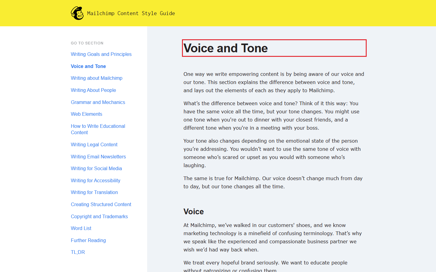
Mailchimp’s published voice and tone guide separates its relatively steady voice from tone that changes with the reader’s situation. Use that distinction when you write examples for happy, routine and difficult moments. Check that a second writer can imitate the brief and sample lines without guessing.
Step 2: Set the approved logo rules
Set the approved logo variants and clear space. Put the actual approved files beside the rule. Name the version to use on a light surface, the version for a dark surface, and any compact mark for small placements. If one of those versions does not exist, say so. Show a correct use and a wrong use, such as a stretched mark or a mark lost against a busy image.
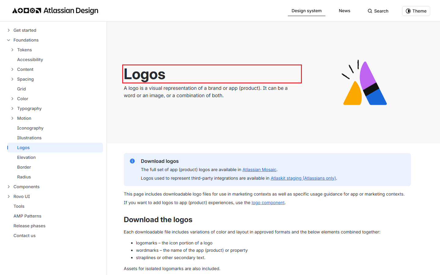
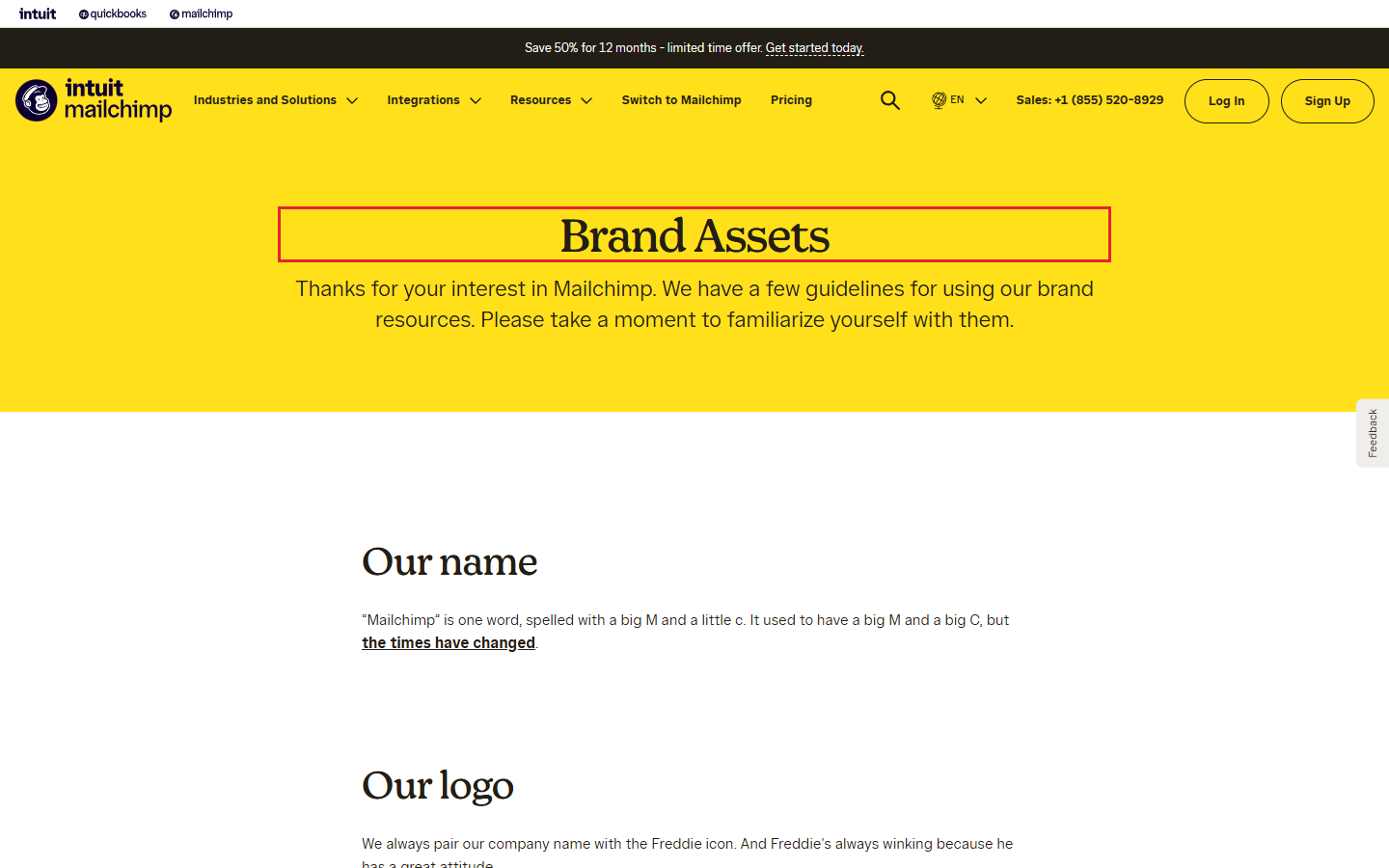
Use a visible part of the mark, such as a letter, to define clear space. Atlassian’s logo guidance uses the capital “A” in its wordmark to define minimum clearance. Its rule belongs to Atlassian, not to other brands. Atlassian's Confluence guide calls for rules on logo placement, minimum size, clear space and approved variants. Mailchimp’s brand asset page directs users to a reverse logo on dark backgrounds. Together, these examples show why the guide should specify both placement and which file to use.
For Sample Bakery, the owner would attach approved light and reverse logo files, then mark the clear-space measure on an image of its own logo. The guide should say not to recolor, stretch or rebuild those files. Because this is a fictional example with no approved logo file, it does not pretend to supply one. Check that a new teammate can select an existing file and place it without changing the mark.
Step 3: Record color roles and type styles
Record the color roles and type styles. A list of attractive swatches is not yet a rule. Say which color is the page background, which carries body text, which marks a primary action, and which is reserved for a warning. Put each approved value next to its role in the guide. Then name the heading and body fonts, their weights, and a fallback that a teammate can use when the brand font is unavailable.
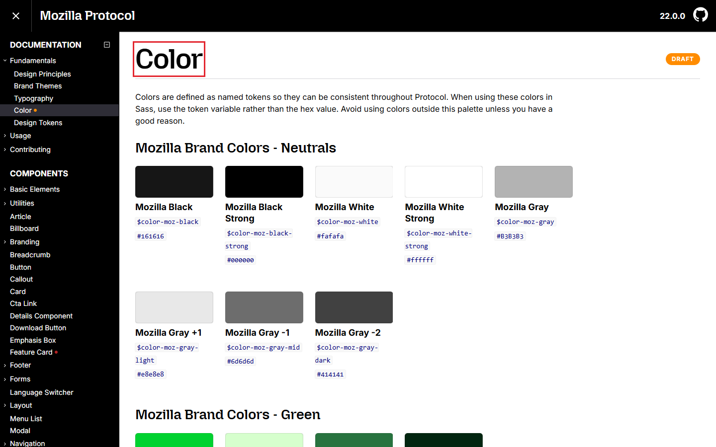
Mozilla’s Protocol color page uses named tokens so its colors can stay consistent. Its brand themes page also separates Mozilla and Firefox with different typefaces and color approaches. Atlassian’s color guidance distinguishes colors by role, including primary actions and warnings, while its typography guidance records font family, size and line height in text styles. These are real examples of precise rules, not a palette to copy.
For Sample Bakery, use a light background, dark text, a warm accent for an order button, and a separate warning style for delivery problems. Write the chosen color values into the business’s own guide only after the owner has approved them. Use a display face for headings and a legible body face for menus and order messages; state which fallback to use in email. Check the combinations on a phone, in print and in the places the business actually posts. Check that each important color and font has a job, not just a name.
Step 4: Test applications and hand off the guide
Test the rules in real layouts and share the guide. Make one example for each format the team uses often, such as a social post, a menu or a landing page. Place the logo, apply the text styles and colors, and write the message in the voice you just defined. Put the finished example next to an example that breaks one rule. Ask a teammate which version is right, then revise any rule they cannot apply.
For Sample Bakery, test a shop sign and an order-delay message. Give the sign the approved logo file, the heading style and the warm accent only where it guides attention. Write the delay message in the plain voice described earlier, without cheerful sales wording. This is a test of the guide’s clarity, not a claim that the bakery exists or that the design improved sales.
Put the guide, editable templates and approved image files in one shared location. Add an owner and a review date, then ask a teammate who did not help write the guide to create a new post using only that material. Record what they still had to ask. The current version should be obvious; old copies should not compete with it. Check that a teammate knows where to ask about an exception after making a new piece.
From decisions to a guide people can use
- Write the audience and voice rules
- Set the approved logo variants and clear space
- Record the color roles and type styles
- Test the rules in real layouts and share the guide
Worked example: Sample Bakery
This is an original Imapro example for an imaginary bakery. It is not a client project, a completed identity or a claim about performance. Its purpose is to show what a teammate should find in a compact guide. Replace every sample choice with your business’s approved decision.
| Part of the guide | Sample Bakery rule | What to attach or check |
|---|---|---|
| Audience and promise | Local customers looking for everyday bread and cakes. Say plainly what is available and when. | Check the wording against a menu and an order update. |
| Voice | Warm in a greeting; direct when an order is late. Avoid jokes in problem messages. | Keep a sample greeting and a sample delay message. |
| Logo | Use only the owner-approved light or reverse file. Do not stretch, recolor or place it on a busy image. | Attach both files and a marked clear-space example. Leave any unavailable file listed as open. |
| Color | Use light for backgrounds, dark for body text and a warm accent for primary actions. Give each an approved value in the final guide. | Test the actual combinations on the shop’s sign, site and phone screen. |
| Type | Use one display style for headings and one readable style for information. Name an email fallback. | Show the styles on a menu, a page and an order message. |
| Ownership | Keep one current guide and the approved files together. Name the person who decides exceptions. | Ask a new teammate to make a post from the guide alone. |
Notice what this example does not do: it does not pretend that Sample Bakery has approved artwork or exact color values. Before using it for real work, attach the owner's approved artwork and values. A useful guide is specific about decided things and honest about undecided ones.
Common mistakes and how to fix them
The guide is a mood board
Replace vague traits with a sample headline, a sample support message and a wrong example. Let a second person choose between them. If the choice is still unclear, the rule is still vague.
The logo section has only one file
Show the version for each actual background the team uses. If there is no approved reverse or compact version, flag the gap for the owner. Do not recolor the only file to fill the gap.
Colors and fonts have names but no jobs
Give each color a role and each text style a use. Then test the most common surfaces. A combination that looks good in a large slide may be hard to read on a phone, so inspect the actual design at the size people will see.
People keep using old files
Put the approved files beside the current guide and say which person can approve changes. Share that location instead of sending new attachments each time. When the brand changes, update the guide and its examples together.
Frequently asked questions
How long should brand guidelines be?
Make the quick reference as short as it can be while still answering the common decisions. Put detailed rules and files behind clear headings. A teammate should be able to find the right logo, text style and voice example without reading the whole document.
Do I need a logo before I write the guide?
You can write the audience and voice sections first. Mark logo rules as open until the owner has approved a real file and its variants. Do not draw a substitute mark just to make the guide look finished.
Is a brand guide the same as a logo kit?
Keep the approved artwork in a logo kit. In the guide, explain when and how to use that artwork alongside color, type, voice and examples. Keep the kit with the guide so the rule and its file are in the same place.
When should I update the guide?
Update it when an approved decision changes or when repeated questions show a rule is missing. Keep the older version out of the main shared location, and tell the people using the guide what changed.
The external examples above describe the publishers’ own rules; the Sample Bakery choices are original Imapro illustrations.