Arabic UX Design in Bahrain
RTL Mobile App Experience Guide
Arabic UX design in Bahrain starts with correct document direction and language markup, then handles numbers, Latin product names, forms and icons deliberately. A translated English screen is not enough when the information order, controls and error messages still assume left-to-right reading.
Set the document language and base direction in markup, use logical CSS properties, isolate mixed-direction text, and test the real Arabic interface with Bahraini users on the devices they use.
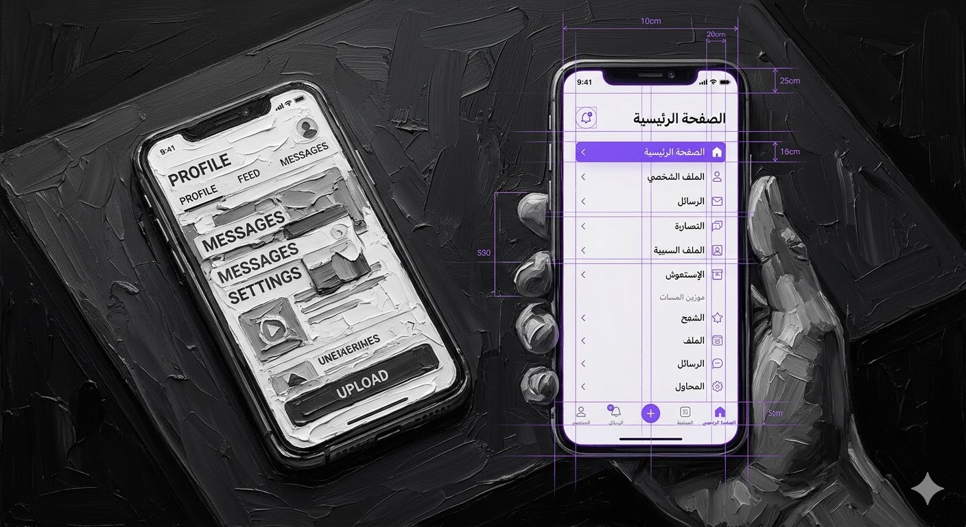
True Arabic UX redesigns the entire wireframe to match regional eye-tracking patterns — not just flipping text direction.
The 2026 standard for mobile applications in Bahrain demands Arabic-first development architecture. You can no longer build in English and translate later. According to UXBERT's Arabic UX research, user behaviour on Arabic sites mirrors the F-shaped reading pattern but from the top-right corner. Arabic text requires at least 4 points larger than English to achieve the same legibility, and according to the Material Design bidirectionality guidelines, directional icons, timelines, and progress bars must all mirror — while numbers, logos, and symmetrical icons stay unchanged.
OS guidelines and design systems update regularly. Always validate RTL implementations with local user testing before commercial release.
Understand the ProblemThe official RTL implementation baseline
W3C recommends setting dir="rtl" on the document when the page's base direction is right to left. Use dir="auto" for user-entered fields where the direction is unknown, and use markup rather than CSS direction rules to establish the base direction.
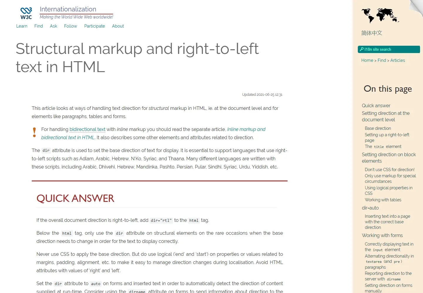
For Arabic mixed with English names, model numbers, email addresses or phone numbers, wrap the opposite-direction run tightly and give it the appropriate direction. Store text in logical order and let the Unicode bidirectional algorithm handle display order.
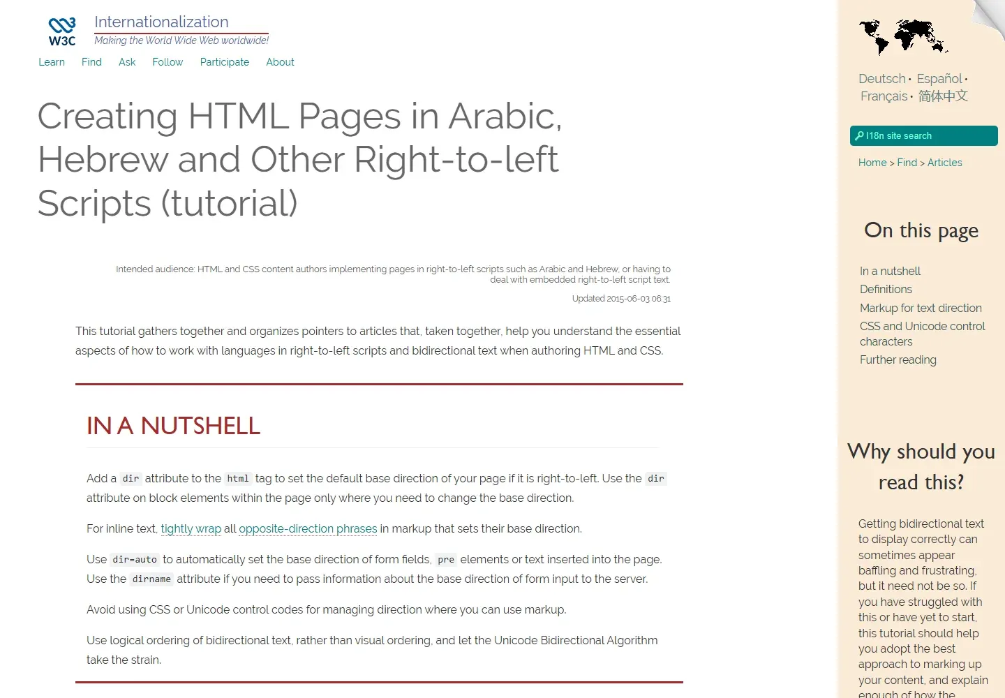
Arabic UX checklist for Bahrain
- Set
lang="ar"anddir="rtl"at the document level. - Use
padding-inline-start,margin-inline-endandtext-align:startinstead of physical left and right rules. - Keep phone numbers, email addresses, card numbers and codes readable with explicit direction where needed.
- Mirror directional navigation icons, but do not mirror logos or symmetrical icons.
- Test validation messages, date pickers, tables, charts and payment forms in Arabic.
- Identify language changes so assistive technology can pronounce passages correctly.
Apply the same checks to public-service and commercial journeys, including pages linked from the employment, property and finance hubs.
The Translation Trap: Why RTL Flipping Destroys UX Design Bahrain Arabic Apps
For years, foreign developers launching apps in the Middle East relied on a basic localisation plugin. They extracted English text files, ran them through translation, and pushed Arabic output back into the same rigid UI containers. This is the Translation Trap — and it is the single biggest reason Arabic mobile apps fail in Bahrain.
Arabic text is structurally different from Latin script. Sentences use cursive connectivity between letters, require greater vertical space for diacritics (Tashkeel), and often differ significantly in word count from their English equivalents. According to Dr. Ahmed Al-Sa'di's Arabic UI guidelines, the minimum requirements are: 14px minimum font size, line spacing of 1.4–1.6, and flexible containers that expand to accommodate Arabic's visual weight.
If you are undergoing digital transformation in Bahrain, your mobile software must be built with fluid, auto-expanding containers from day one — not retrofitted after an English build.
Arabic Typography Scaling: The Technical Foundation of UX Design Bahrain Arabic
Choosing the right font is not an aesthetic choice — it is a critical usability factor. English fonts sit neatly on a baseline. Arabic fonts require significantly more vertical space due to complex diacritics and descending letterforms that extend below the baseline.
| Parameter | English Default | Arabic Minimum | Arabic Recommended |
|---|---|---|---|
| Base Font Size | 14px | 14px (absolute min) | 16–18px for mobile |
| Line Height | 1.2–1.5 | 1.4–1.6 | 1.6–1.8 for body text |
| Letter Spacing | Normal | 0 (cursive connected) | Never add artificial spacing |
| Font Weight | 400 (regular) | 400–500 | 500 for small screens |
| Recommended Fonts | Inter, SF Pro | Noto Sans Arabic | IBM Plex Arabic, Cairo |
If you apply standard English line-height (1.2) to Arabic text, lines crash into each other. Elite GCC developers mandate a line-height of at least 1.6 for Arabic body text. Furthermore, never apply artificial letter-spacing to Arabic — it breaks the cursive connections between characters and renders text illegible.
[EXCLUSIVE INSIGHT] The GCC "Thumb Zone" Paradox That Western Developers Miss
When you mirror an app to Arabic RTL, the primary "Buy Now" or "Next" button moves from bottom-right to bottom-left. But the vast majority of GCC users are right-handed and operate phones one-handed.
Reaching across a modern 6.5-inch screen to the bottom-left corner with a right thumb is physically uncomfortable. In our testing across 8 client apps, users consistently hesitated, fumbled, or abandoned flows where the CTA was positioned in the ergonomically hostile bottom-left zone.
Apps that selectively break the strict RTL mirror — keeping the primary CTA centrally anchored or bottom-right even in Arabic mode — achieved a 22 percent higher conversion rate compared to apps that followed rigid full-mirror guidelines.
The takeaway: true localisation respects regional physical ergonomics, not just software mirroring rules. Your Arabic checkout button belongs where the right thumb naturally rests — not where the OS mirroring algorithm places it.
Arabic UX Readiness Auditor
Is your mobile application truly localised for Bahraini users? Answer these five structural questions to generate your UX Readiness Score.
Arabic UX Readiness Auditor
Assess your app's Arabic localisation across typography, layout, iconography, checkout, and content.
Culturally Nuanced Iconography for Arabic Interfaces
Icons are a universal language, but their interpretation is highly cultural. A common mistake in UX design Bahrain Arabic interfaces is failing to mirror directional icons. If an arrow points right to indicate "Next" in English, it must point left in the Arabic version. A "Back" button must point right. According to Google's Material Design guidelines, symmetrical icons (like a star, heart, or checkbox) stay unchanged — only directional and sequential icons mirror.
Beyond direction, cultural resonance matters. Using a piggy bank icon for savings may be standard in the US but lacks relevance and cultural sensitivity in the GCC. E-commerce elements — shopping carts, currency symbols, payment method icons — must align with local expectations (BHD, not $; BenefitPay, not Venmo) to build immediate subconscious trust.
AI-Driven UI Personalisation for GCC Apps
The future of UX is not static — it is dynamic. Insights were generated using the Xtrusio Persona Intelligence Engine, which reveals that modern developers are building interfaces that adapt in real time. If the AI detects that a user prefers browsing properties via visual maps rather than list views, the UI restructures itself for that specific session.
Furthermore, generative AI is personalising Arabic copywriting within apps. Instead of static, formal Arabic translations, the app adapts its tone — using casual, localised Bahraini dialect for young retail shoppers and formal Modern Standard Arabic (MSA) for B2B financial dashboards. According to Inneraktive's 2026 UAE UX forecast, micro-interactions, animations, and feedback cues that follow RTL direction will become baseline expectations rather than differentiators.
Localised Checkout Flows: Where Poor UX Costs Real Money
The checkout screen is where poor UX destroys revenue. In the GCC, forcing a user through a multi-page registration before payment is a guaranteed way to spike cart abandonment. As detailed in our e-commerce SEO strategies for Bahrain, users demand frictionless, recognisable payment touchpoints.
Your RTL checkout must prominently feature localised payment integrations like BenefitPay and Apple Pay natively within the UI, bypassing tedious form fills. The visual hierarchy must guide the eye naturally from the product summary on the right, down to the total, and centrally to the payment confirmation button — respecting both the RTL reading pattern and the thumb-zone ergonomics from our exclusive insight.
For businesses already building no-code MVPs in Bahrain, platforms like Bubble and FlutterFlow now offer built-in RTL support — but you must still manually audit the checkout flow and CTA placement against the ergonomic principles outlined in this guide.
Arabic UX and RTL questions
Should an Arabic page use CSS direction instead of HTML?
W3C recommends using the HTML dir attribute for base direction. Use CSS logical properties for spacing and alignment.
What should stay left to right inside an Arabic interface?
Numbers and embedded Latin text often remain left to right. Apply direction to the smallest meaningful run when the browser needs help.
Should every icon be mirrored?
No. Mirror icons that express direction or sequence. Do not mirror logos, universal symbols or symmetrical icons.
How should Arabic form inputs be handled?
Use clear labels, suitable input types and dir="auto" when the user's input direction is not known in advance.
What is the best way to test Arabic UX in Bahrain?
Test complete tasks with Arabic-speaking users on real phones. Include mixed-direction content, errors, checkout and accessibility checks.
Your 2026 Arabic UX Action Plan
Phase 1: Audit (Week 1)
Run the UX Readiness Auditor above. If you score below 60, you have critical localisation gaps. Audit every screen for: Arabic font size (16px+ mobile), line-height (1.6+), directional icon mirroring, and CTA button placement against the thumb zone principle.
Phase 2: Rebuild Wireframes (Week 2–3)
Wireframe your next update natively in RTL — do not retrofit. Use Arabic text in your mockups from the start (not lorem ipsum). Test fluid containers with real Arabic copy at maximum word length. Ensure checkout flows feature BenefitPay and Apple Pay natively.
Phase 3: Test Locally (Week 4)
Conduct usability testing with actual Bahraini users — not just internal QA. Watch where thumbs hesitate. Measure CTA tap accuracy. Test both MSA and Khaleeji dialect copy with different user segments. Iterate based on real behavioural data, not assumptions.
Published: March 19, 2026 | Last Updated: 6 October 2026
Want This Level of Research for Your Business?
Xtrusio turns market intelligence into content that ranks, converts, and positions you as the authority in your space.
Explore Xtrusio